The Newton: Elegance and Nature in Amsterdam
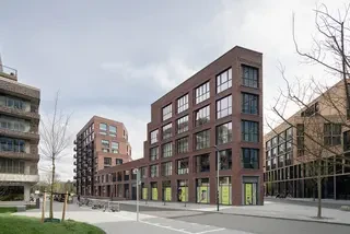
The complex contours of the plot presented a particular challenge in designing this residential building with 101 apartments in Kop Zuidas. To avoid the rigid layouts of dark blocks, diederendirrix took a radical approach: a large cut through the middle of the building brings both daylight and nature deep into the interior.
Client COD requested diederendirrix to create a design for an apartment complex in the unoccupied sector of Kop Zuidas. The location, characterized by a sharp point and complicated contours, posed an architectural puzzle. By shortening the point and making a straight cut through the building volume, the hermetic form was broken open. The result is spectacular – the outline changes from a straitjacket to a more relaxed, playful structure that provides a greener living environment to the otherwise stony Zuidas. The design was supported from start to finish by both the client and the City of Amsterdam, without major changes during the process.
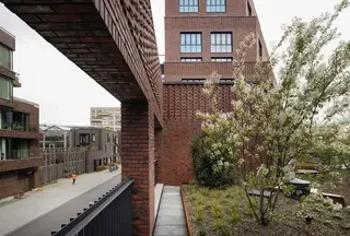
Semi-public Roof Garden The sections of the building that give the apartments a two-sided orientation do not extend to the ground floor but end above the plinth. Here, in close collaboration with landscape architects Felixx, a green oasis in the form of a raised courtyard or roof garden was created. This is connected to the planned public green space on the other part of the plot via a wide stone external staircase. Green is a central theme of the project. By involving a landscape agency from the outset, high-quality, water-repellent green areas were created to promote biodiversity. The maintenance of this carefully selected vegetation will be managed collectively.
Stepped Terraces The ecological approach is also evident in the terraces that emerge along the periphery of the inner courtyard. The façades recede by one meter every one or two floors. These stepped terraces provide space for a cascade of greenery and allow ample light into the apartments. Nearly floor-to-ceiling windows further enhance the intensity of the light. Solar panels and thermal energy storage on the roof ensure that as much sustainable energy as possible is available.
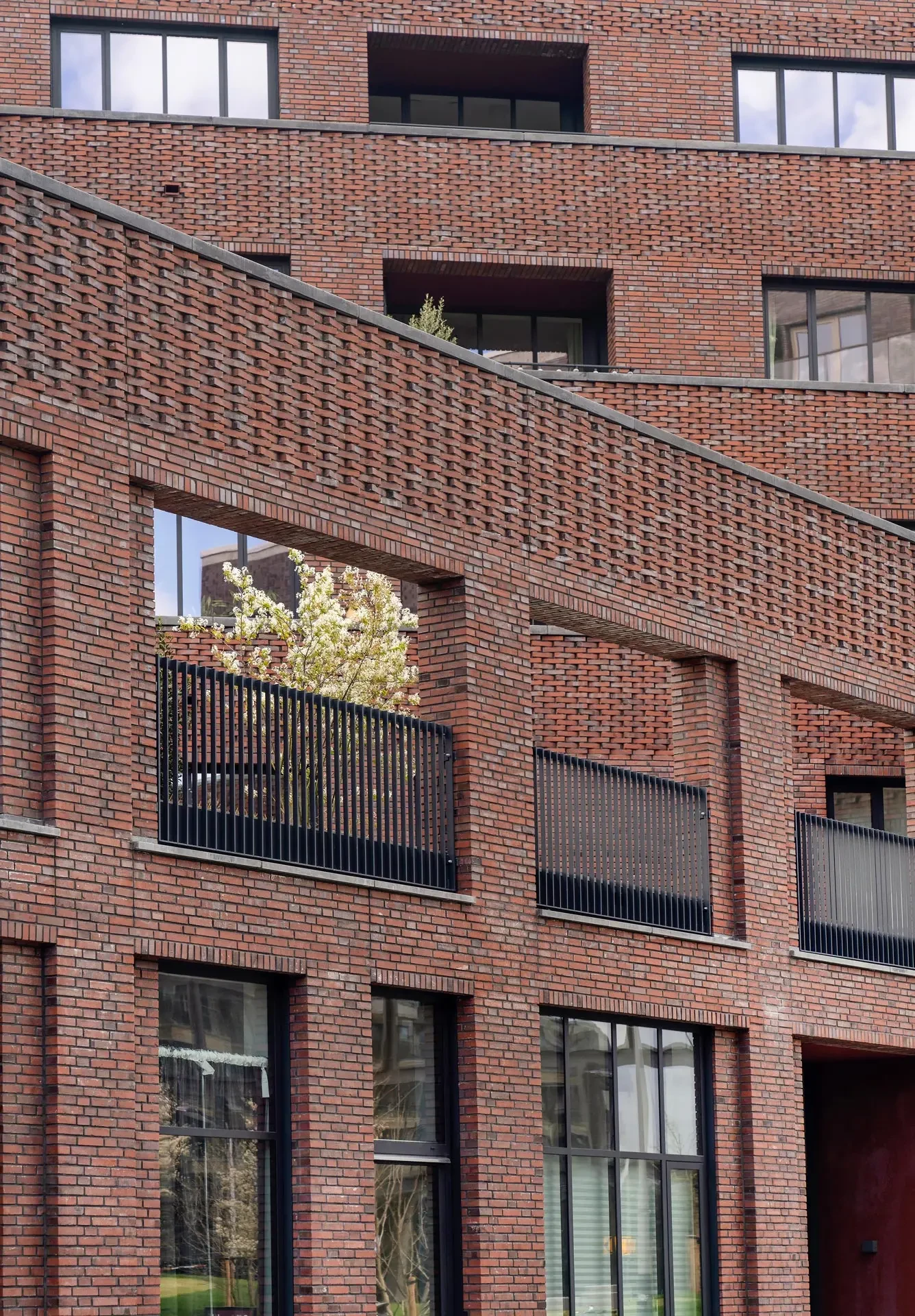
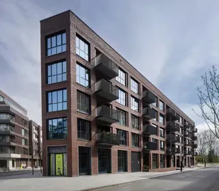
Two Worlds The architecture of the Newton creates two worlds that play with the contrast between hard and soft. From the outside, the building presents itself as a sculptural, modernist structure with clean lines. Structured red brickwork and industrial windows with sleek aluminum frames give the building a robust appearance. At the same time, the building offers glimpses into a much softer and greener interior world that stimulates the imagination.
Brickwork and Decorative Masonry The exterior façade of the building consists of structured red bricks of sorting No. 62 from Wittmunder Klinker. These bricks were laid alternately, showcasing both the smooth and rough sides (foot side), giving the façade an interesting texture and depth. A notable architectural detail is the decorative masonry, where bricks were partially set diagonally in relief.


